Role
UX/UI Designer
Tools
Figma
Project Type
UX/UI,
A/B Testing
Industry
e-commerce
Duration
2 weeks

Users were abandoning checkout as they were unaware of the number of items they were adding from the product page. There wasn’t a clear functional update to the pricing causing frustrated users to bounce. The client was looking to reduce bounce rate and increase their conversion rate.
I went through the buying flow to locate some potential friction points for users. As it turns out, users weren’t able to see the price increase with multiple quantities of product added which came as a shock in the cart/checkout. To alleviate that pain point, I opted to modify the existing Add To Cart (ATC) button to reflect an updated pricing each time the user added to the quantity.

A simple solution to be sure, but as it turned out, was incredibly successful for the client. Updating the price with the quantity in this ATC while still having the original price visible is effective for the Stamps.com user. This eases the user friction as they build and place their orders.
Conversion Rate
revenu per visitor
est. quarterly lift
How We Got Here
Stamps.com is a one stop shop for printing postage, scheduling pick-ups, and managing mailing and shipping operations with ease.
With over 4+ million customers and 28 years in the business, Stamps.com provides efficient, flexible solutions for domestic and global shipping.
The goals for this project were:
improve overall user experience
reduce bounce rates across all touch points
increase overall conversion rate
One of my main considerations was trying to determine why users were bouncing at the rate they were.
Heatmaps, in conjunction with analytics data suggested users were abandoning their carts in checkout at a rate of 63%.
I hypothesized that users were finding the flow to be opaque and unclear as they were adding items to their carts. To mitigate that, I suggested we make some slight adjustments to the product pages by providing the user with clear, transparent pricing thru adding the total price in the ATC.
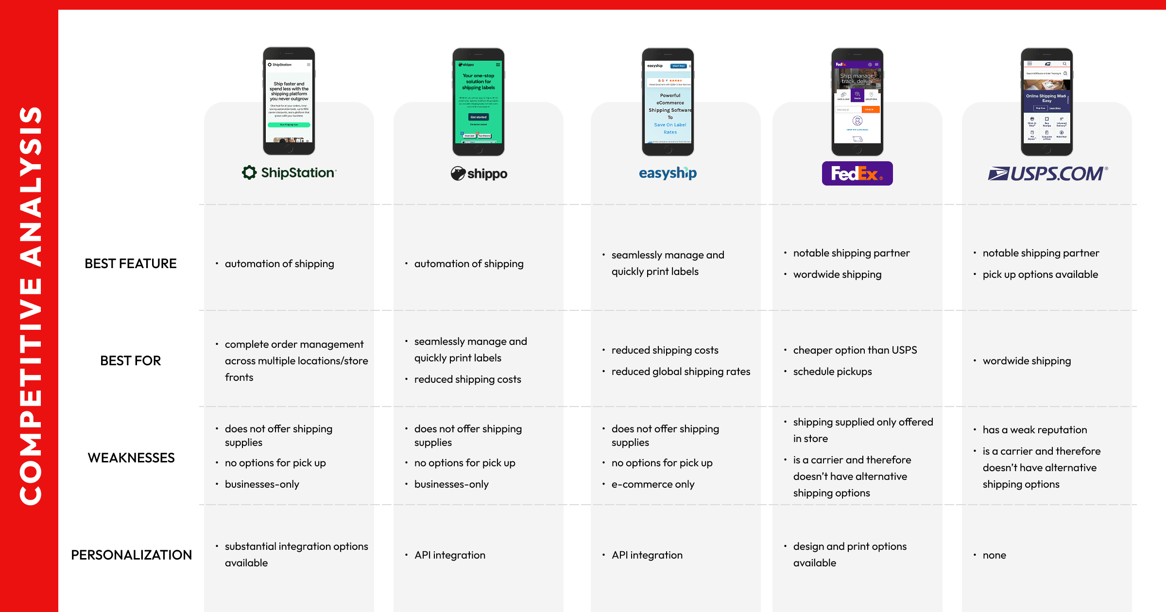
In order to fully understand how Stamps.com functioned in the shipping space, myself and the account manager, did a dive into both direct and indirect competitors allowing us to highlight the value props Stamps.com brought to their users.
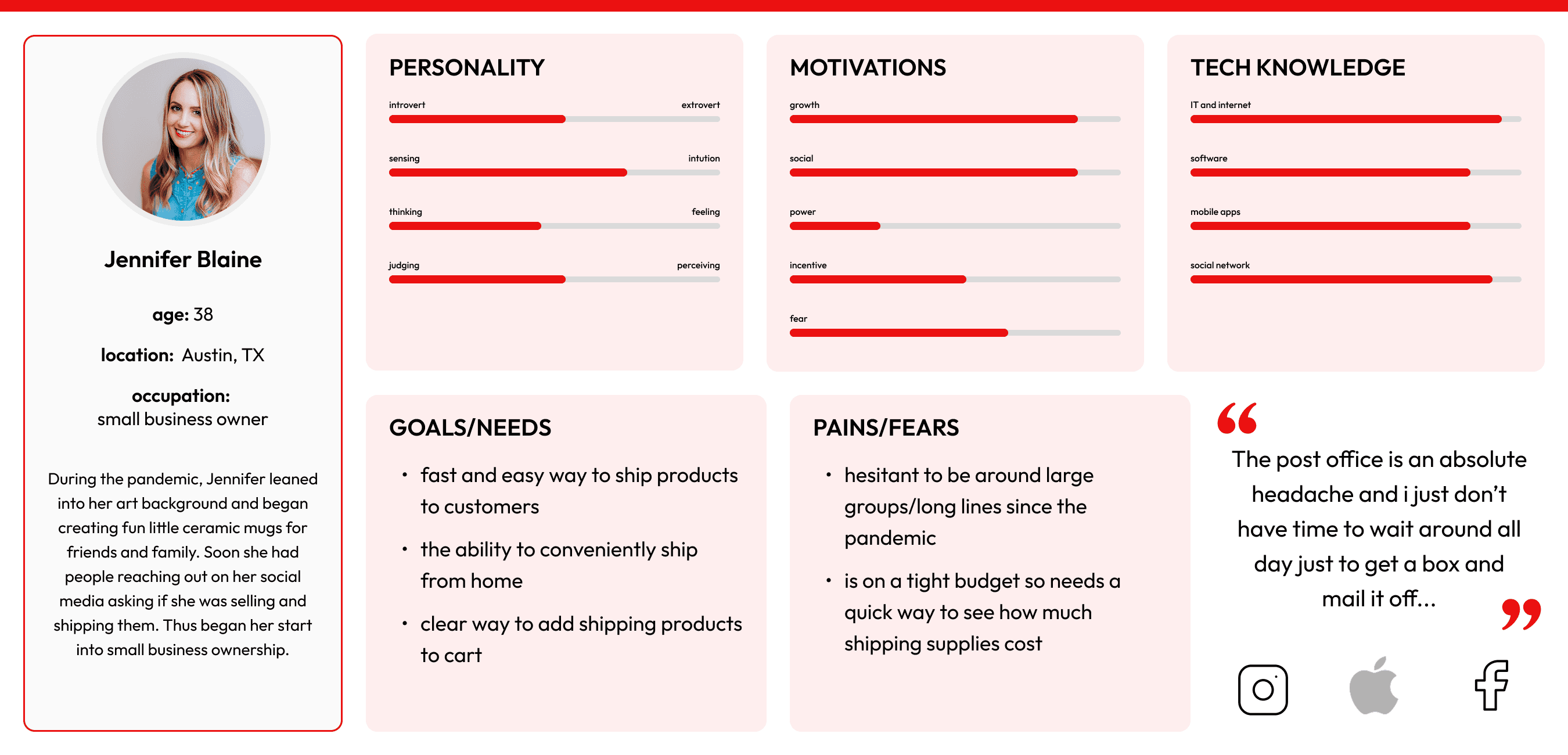
With the help of analytics, and in discussion with stakeholders, we developed a persona from which to base our possible solutions.
Building lasting solutions requires full consideration of how user’s interact with Stamps.com. While not every persona has a use case, we landed on a the Independent Entrepreneur.
This small business owner, still reeling from pandemic, needed a simple and efficient way to order supplies and send her products across the country without having to spend unnecessary time at the post office.
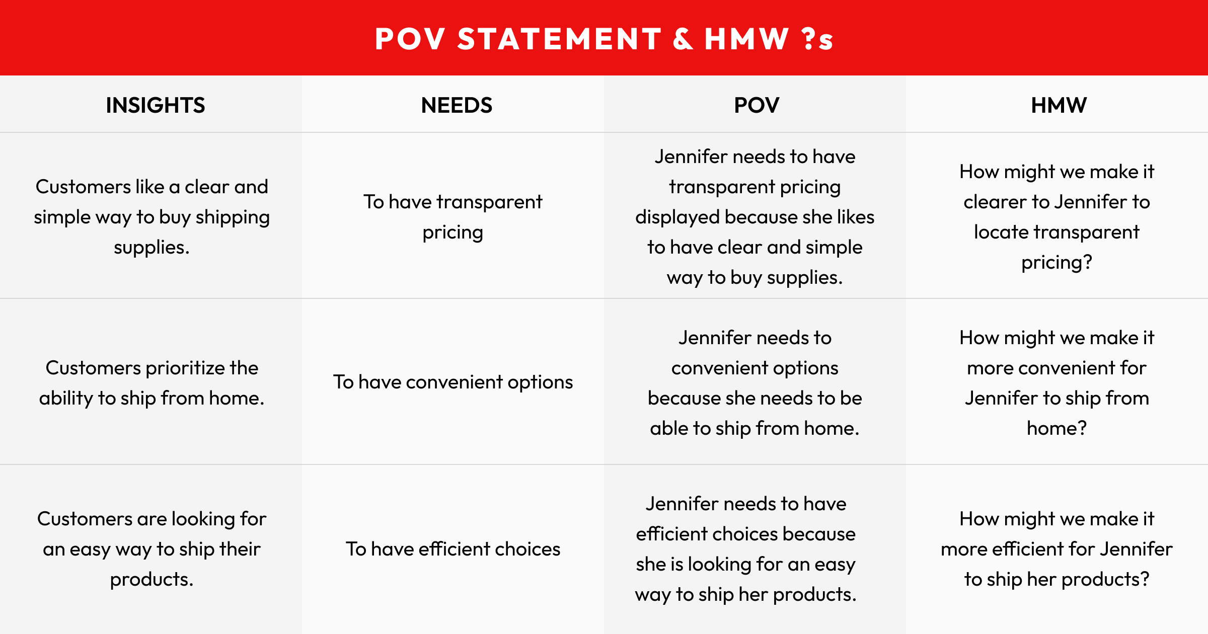
Developing a clear idea of what would alleviate friction for our persona, I explored some potential options that reflect our persona’s specific needs.
Combining my initial hypothesis with How Might We statements lead us down a clear path towards a relatively easy solution:
How might we make pricing more transparent?
The task flow flows our persona’s journey from landing on Stamps.com to completing a purchase. I noted all the potential decisions that she would encounter through the flow.
Noting the bounce rate at checkout, it became clear that were some issues moving from product page to the final purchase.

Using my hypothesis, in conjunction with locating the pain points in the user journey, I opted for a couple solutions that we used as variants in our A/B testing.
Using my hypothesis, in conjunction with locating the pain points in the user journey, I opted for a couple solutions that we used as variants in our A/B testing.
Testing over roughly a twe week span showed:
+5.03% conversion rate
+7.40% revenue per visitor
+10,641.28 estimated quarterly lift
A simple solution is often the best solution. Users need clarity and transparency to be able to convert to a sale.
A lot of my work as a designer was to maintain alignment between our respective teams and stakeholders.
Advocating for a simple solution when stakeholders expected larger adjustments meant clear communication and the willingness to push back (just a little) to provide the user with the best experience possible.