Role
UX/UI Designer
Tools
Figma
Project Type
UX/UI,
A/B Testing
Industry
e-commerce
Duration
2 weeks

The client wanted to highlight a tiled element on their homepage but weren’t sure how to best do that. The tiles provide a quick bit of information on their offered services so without adjusting the content, I had to find a way to bring in the user’s focus.
The tiled element was rather long on mobile so to leverage that space, I opted to bring in a carousel to the page. I made some tweaks to the tiled cards to generate a standard height/look before placing them on a carousel.
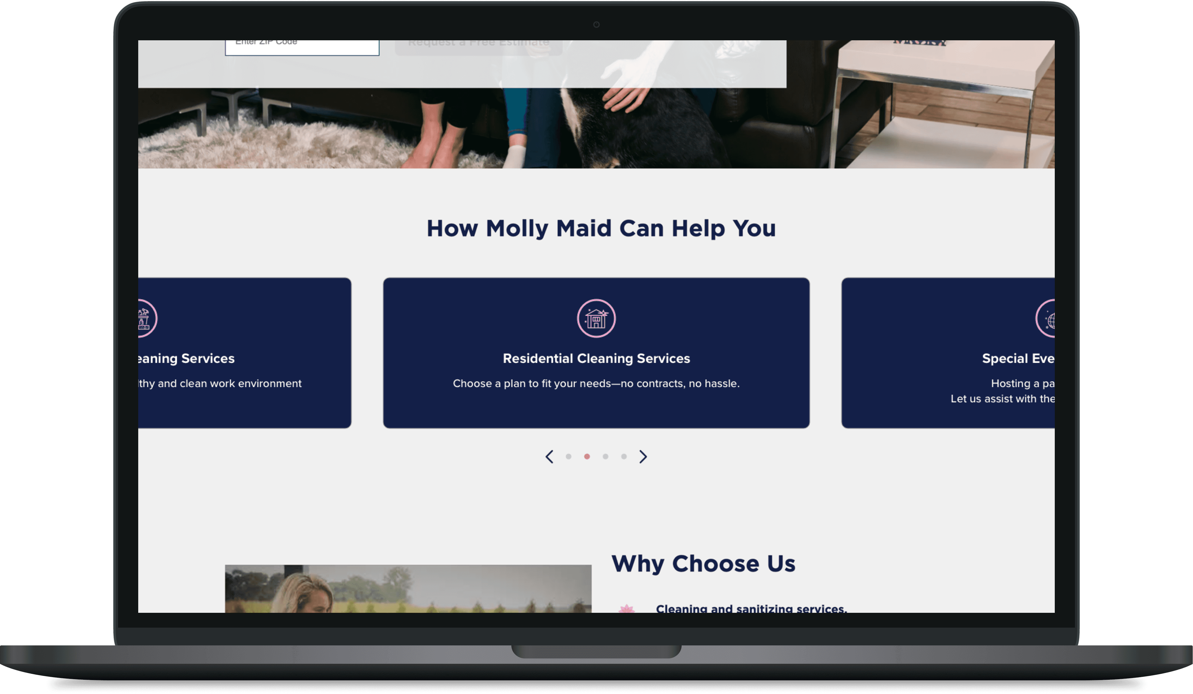
What I thought would be an obvious home run for mobile turned out to cause some friction with users. Despite that, desktop users found the carousel to be a better, more eye catching experience.
Given the lack of buy in from mobile users, the client opted to iterate and retest at a later date.
Conversion Rate
est. quarterly lift
(form completions)